Apple Podcast redesign
So I have been an avid listener to podcasts, mainly using the Apple Podcast app. I generally pop one on when it’’s time to sleep, and with it droning out other thoughts, it feels like falling asleep to a movie.
Over 6 months of use, it has come to my attention that I was confused as heck. I always praised Apple products on their intuitive user interfaces. Having switched to an IPhone not too long ago, I felt there was a very small learning curve. I was able to navigate more efficiently after a couple days of use than using an Android for years.
But…. Apple Podcast is the death of me.
Comparative Analysis
Metrics for analysis
Looking at the three main competitors for podcast apps, we conducted user tests to rate each aspect. We also analysed the functions available and their value to the experience.
We are focusing on three main points
Usability/Efficiency
User flow
User/product goals
Specific screens
Search page
Now playing
Library

User Analysis
Behaviours
The main influences for listening to podcasts are:
Using Podcasts as a source of entertainment.
Enjoying the timeshifting and accessibility element of being able to listen wherever they want to.
Being able to tap into the social aspect where they can share podcasts with friends.
Most users are focused on the subject matter itself, rather than the podcasts’s program/show.
This analysis is used as a benchmark for choosing applicants to user testing and which parts of the app to test.

Testing parameters
I decided to perform the user suveys in real life, because starting the case study was based off of problems I had solely, I had to see if it was just me? or was it everyone?
They were prompted to navigate the application themselves so I could see how different users approach it.
I then went on to give them specific actions, such as
- Look for a specific podcast by name (guest/host/show).
- Try and find a specific podcast saved in their library.
- Finetune the listening experience with the functions available.
User notes
These are the main fustrations that users mentioned during the test.
Search
Deletes podcast after listened through and does not keep a record anywhere.
Can’t look for specific podcasts by name without having to go through multiple libraries (host/show).
Information is presented confusingly, for example, searching for a specific guest presents a full page of shows with their hero image rather than targetted episodes.
Explore page has a long scroll, counted 8x the view height, users don’t want to look that long for a podcast.
Listening
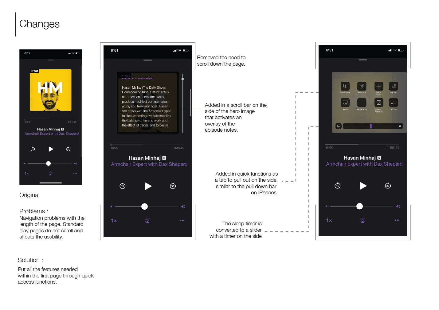
A quarter of the users did not realise you could down on the screen to access quick functions.
The page is designed similarly to the Spotify app, they hold the same users but usability is different.
Library
Tapping on a podcast goes straight to the play page, cannot access podcast information.
There is no filter function in the library, episodes are added in due to their date.

Users of the podcast app are also found to be familiar the apps below. I’ll use these apps for some reference and to analyse the usability patterns
Gap Analysis
The biggest benefit to listening to podcasts is the convenience of being able multitask while listening in the background. There is a need for users to navigate the Apple podcast app easily, so our main focus is to…
“Optimise page layouts to prioritise what the user is searching for and categorising it efficiently”
Defining solutions
Problem
Solution
The only search filter is between all podcasts and your library, this leads to a confusing result page because the user is unable to tweak their experience.
Adding in more filters, and adding a search bar to the library will lead to an easier user flow by differentiating between the spaces.
There is no way of seeing recently played episodes and the library puts a higher emphasis on “Recently Updated“, though a majority of users don’t subscribe to shows.
Caterring the categories to the user’s wants, and adding in more information so there is less of a need for lengthy navigation.
Navigation problems with the length of the page, a quarter of the users didn’t realise that they could scroll to find functions and this affects its usability.
Adding in all the features within the front page through quick access functions.
Persona

Stacey
Age: 30
Occupation: Marketing manager
Personality: Driven, intuitive, keen to learn
Goals:
Increase her skills in her spare time
Understand social media strategies in different forms of entertainment
User case:
She wants to use Apple podcast to listen during her travel and work hours.
Using podcasts as a form of education, she needs to be able to use search filters to find specific topics.
It helps her with her job, so she needs to be able to categorise her podcasts effectively to use.
Sketches
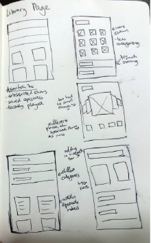
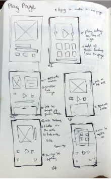
I drew out a couple low fidelity wireframes, to show users.
This helped me gain some insight as to how familiar users are with different interfaces and which ones would be the most efficient
I decided not to deviate from the UI design too much as it didn’t seem to be the problem with the original application, but rather the functionality of the interface.
High fidelity Prototype
With the research above, I created the high fidelity prototypes. I kept to the same UI Design to keep the same continuity with the rest of the Apple apps. I made sure that the new functions replicated the same usability with iPhones, knowing that users would be familiar with that user interface.
Now playing
Library

Search

What I’ve learnt
In the course of redesigning this application, I put most of the focus into researching and user testing.
I found that it isn’t always necessary to completely redesign the entire applications. Minor adjustments could help the user flow without losing the UI familiarity.
While most of my applications before were designed with the visuals in mind, I found that creating and testing with low fidelity sketchs allowed me to gain a better understanding of how the user navigates a page. This helps me put the user experience on the highest priority, rather than putting too much effort into the visual design.
I hope you enjoyed this case study!